

#1 Graphic Design and Installation in Dallas-Fort Worth
#1 Graphic Design and Installation in Dallas-Fort Worth

Each letter is cut from solid coloured film, weeded by hand, and applied individually to the glass. There is no printed background, no visible panel edge, no rectangle around your name. Applied properly with a level line, it reads as though it was etched or painted directly onto the window.
It is also inexpensive relative to almost everything else on a storefront. Part of the iCandy Grafix storefront graphics service, and the same technique is used for interior wall lettering.
The default for storefronts is the right answer roughly seven times out of ten. Most shop interiors are darker than the daylight outside, so white reads with maximum contrast from the pavement and from the road. Matte rather than gloss, because gloss vinyl catches low morning and evening sun and creates hotspots that make lettering hard to read at an angle.
Correct where the interior behind the glass is bright, where there is a pale wall directly behind, or where the window is backlit. On a dark interior, black lettering vanishes into the glass.
Looks like sandblasted glass and costs a fraction of the price. Cut into logos, patterns, banded privacy strips, or full panels. Used constantly by law offices, accountants, dental and medical practices, salons, and any business needing privacy at seated eye level while keeping the space bright. It is also fully removable, which real etched glass is not, and that matters in leased premises.
Traditional and understated. Works particularly well for professional services, jewellers, and hospitality. Loses impact on light-coloured backgrounds, so check the interior first.
Any Pantone, cut from solid coloured film. Worth noting that mid-tone brand colours often read poorly on glass against a dark interior, and we will say so before cutting rather than after.
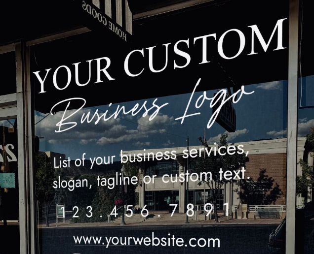
The working rule is roughly one inch of letter height for every ten feet of viewing distance. It is approximate, but it is close enough to plan with, and it prevents the most expensive mistake in storefront signage.
A shop sitting directly on a pavement, read from fifteen feet, works fine with two-inch lettering. A unit set sixty feet back behind a parking row needs a minimum of six inches for the main name. A frontage facing a road where traffic moves at forty miles an hour wants ten to twelve inches, because a driver has roughly two seconds and needs to register the name inside that.
Small lettering on a setback frontage is money spent on something nobody will read. We will tell you this before printing, even when it means quoting a larger and more expensive job.
Name and logo, largest. What you do, if the name does not make it obvious. Phone number. That is normally enough.
Hours, payment methods, and social handles belong on the entry door, not on the main window, because those are close-range information and the main glass is long-range information. Mixing the two produces a window that communicates nothing clearly at either distance.
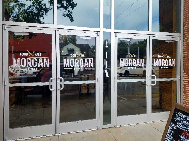
The glass is cleaned with a non-ammonia solution and dried completely, since cleaning residue is the most common cause of edge failure. A level or laser line is set. Smaller lettering is applied dry; larger runs are applied wet so they can be repositioned before the adhesive grabs. Everything is squeegeed from the centre outward, and the transfer tape is removed at a sharp angle.
Anything over about 24 inches wide gets two installers. A single person handling a wide application alone is how creases happen, and a crease in cut lettering cannot be worked out afterwards.
Cut vinyl window lettering typically costs $150 to $600 for a storefront, depending on letter size, the number of glass panels being lettered, and whether a logo is included. iCandy Grafix quotes by design and includes professional installation across McKinney and the wider Dallas-Fort Worth area.
Allow roughly one inch of letter height for every ten feet of viewing distance. A frontage read from fifteen feet works with two-inch letters; one set sixty feet back needs six inches; and a window facing forty-mile-an-hour traffic needs ten to twelve inches for the main name.
Matte white is the most readable on most storefronts because shop interiors are usually darker than the daylight outside. Black works where the interior is bright, or there is a pale backdrop behind the glass. Send iCandy Grafix a photo of your frontage taken during opening hours, and we will tell you which will read better.
Visually, it is very close, at a small fraction of the cost. Frosted vinyl film produces the same soft translucent appearance as sandblasted glass and can be cut into logos, patterns, and privacy bands. It is also fully removable, which real etching is not, making it the sensible choice in leased premises.
Interior-applied cut vinyl lettering lasts 5 to 7 years on storefront glass, and exterior-applied lettering lasts 3 to 5 years in North Texas sun. iCandy Grafix applies to the inside face wherever the design allows.
Copyright © 2026 iCandy Grafix. All rights reserved. Powered by Fast Hippo Media

